From a great business story comes inspiration. From a glimpse into the people involved, we make a human connection. And through these tales behind the things we love we gain meaning, understanding and appreciation.
In a nutshell, that’s the oomph behind our new feature section.
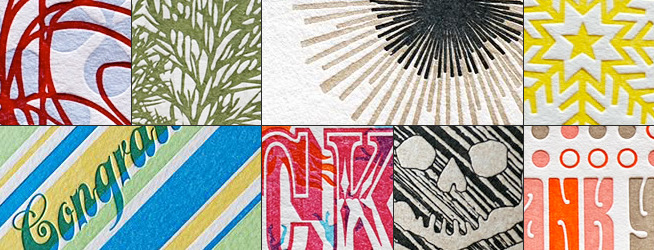
We reached out to Vivian Leung, founder and principal creative at 9SpotMonk Design out of Glen Rock, NJ, to learn more about her printing studio and her diverse collection. Lucky for us, she agreed—and was quite a privilege to collaborate with.
9SpotMonk has a design philosophy that we find irresistible, “You will either agree with the following statement or not: Design matters. If you agree, then you’ll be quite happy with the work of 9SpotMonk Design.” In addition they describe themselves as craftsmen, artists, a tinge perfectionist, and just as focused on the tactile aspects of their products as the visual.
Over the past couple years 9SpotMonk has implemented a Green Focus commitment with great success. The studio recently launched their ecoModern® Custom Wedding collection with initiatives that include 100% cotton paper as their primary stock, purchase of wind power energy credits equal to the shop’s usage and participation in the Plant A Billion Trees program.
As you’ll see 9SpotMonk is quite the talented small team. Sold nationwide and abroad, from your favorite local stationer, to great kids stores like fawn&forest, to seasonally at Urban Outfitters. Nearly ten years in, and the collection screams personality—much of it, courtesy of Vivian…
Take us back to the first couple years of 9SpotMonk. You started your design studio in 2001 and then began to really focus on letterpress in 2004. How did the studio come about and who was involved?
9SpotMonk started after my interactive department [at a NYC creative agency] shut it’s doors right before 9/11. I had just returned from our honeymoon in Positano, Italy and thought maybe this was a mixed blessing, an opportunity to do something on my own. There weren’t many jobs available at that point and [I knew] in a few years I would want to have children and that being with them growing up was important to me, so a flexible schedule was key.
The business started with mostly site design, architecture, etc jobs and then I started branching out to do print design, both personal and business correspondence. In 2003, I started researching on how I could do small scale production of the paper related work I designed. That research led me to letterpress.
My first press was a Model 0 Poco Press. I found it on Briar Press. I thought it was the ideal press—12 by 18 bed size, had a tympan and frisket made by the owner, I could do pretty tight registration.
I picked up the press in North Adams, MA, driving over 5 hours each way. The press was all about hand inking and feeding. It was true letterpress printing by hand and definitely not for production work. (the press was eventually sold back to it’s previous owner, we did an exchange—his Vandercook SP-15 for my Poco and a huge stack of Benjamins).
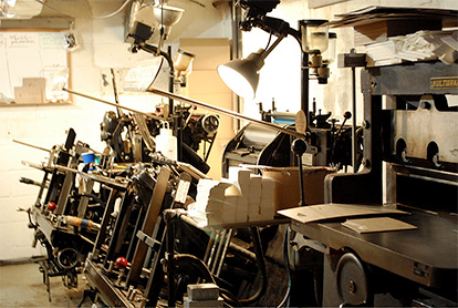
As time went by and I was asked to do more wedding invitations I thought I could turn this into a small business. In 2004, 9SpotMonk Design debuted at the National Stationery Show with a custom wedding album consisting of 6 designs. I had 15 appointments for the show and embarrassed to say, was late to my first appointment.
Who makes up today’s 9SpotMonk team?
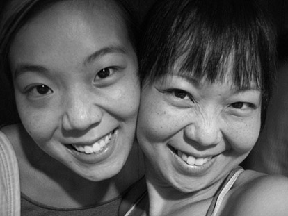
I am the founding partner of 9SpotMonk. In 2006, my sister Tiffany Leung (left) joined me after stints at MTV and Comedy Central working on digital design projects. We also have part time staff for production and studio work. We have a studio production manager who works with custom clients, answers emails and keeps me in line with the schedule.
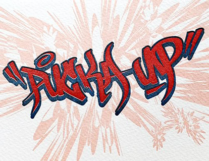
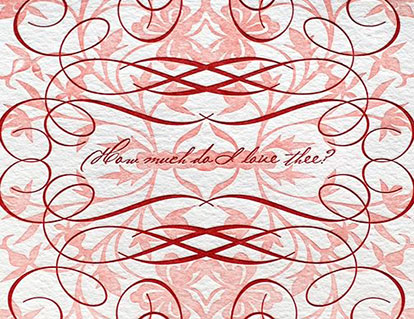
Your work has a very eclectic style that’s sometimes soft and feminine and other times wild and urban. Tell us about where your inspiration comes from. What are your influences?
We’re influenced by everything that’s around us—NYC—uptown, downtown, Chinatown, the quiet life of the suburbs, Rothko, Schiele, Ellen Lupton’s writing, work from Studio on Fire, the trees in the back yard, modern architecture, kids, vintage jewelry, friends, family, etc.
My husband, who is also in design (fashion design) brings some beautiful things to my attention during his travels. And then there are the kids, they are the ultimate inspiration. I would just for a moment want to see the world in their eyes.
When creating a new design, where do you start—sketching, at the computer, at the press?
With new designs, we always start on paper. Tiff and I are art students so everything starts on paper and then if need, we transfer designs to the computer and modify/clean up there. There’s also a good amount of design right on the press. Thoughts/designs put on paper sometimes translate differently when printed. At the press, I can move around/change graphics and change ink colour.
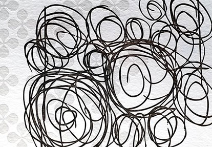
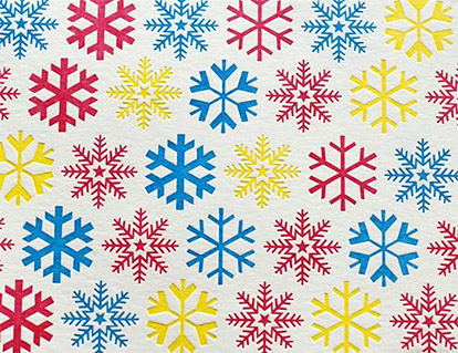
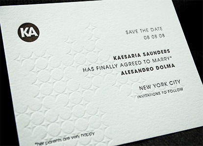
From the variety of visual choices you carry at your store you obviously have a knack for bringing your ideas to life. Can you tell us about an idea for a design that you’ve had in you head but never could quite get it right on paper?
Oh man, there are many. I am one of those people who have an idea or suggestion for everything but not everything makes it to the end product.
From our designs you can tell we don’t do cute, as a matter of fact, I think I’m incapable of it. We launched a custom birth announcements book a few years ago and I wanted to do those cute drawings of pacifiers and bottles and baby animals but the book ended up being modern with streamlined graphics, type and bold colours. I will keep trying…
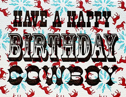
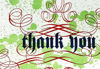
Typography seems to play a big part in your designs. Would you say that a typeface influences your overall concept for a project, or the other way around?
I did a lot of typography work in art school and yes it does influence the design. Inspiration for the typography and type insertion can happen at any time during the design process—it depends on the project. Sometimes its before the graphics are designed, sometimes after.
Our Recession line was the first line we introduced with no graphics, just type. So that drove the entire collection. I picked fonts I thought would lend a ‘voice’ to the copy. Apparently we did something right, the Recession line is one of our best selling lines. For our graphic inspired greeting cards, type was added at the end.
At a time when emails and tweets are the norm, it seems that the business of hand-touched gifts and stationary is booming. What’s your take on that or what do you perceive from your customers?
That is an interesting question… my background in college is fashion design. Spending a good number of years touching fabric, draping on a mannequin fueled my love for touching textures. I spent about 4 years in the fashion industry and about 5 in interactive advertising. Needless to say, I missed the tangible-ness of touchable things. I would constantly buy notes and journals and pads, I just wanted to use a pen, not a stylus! to write something. So maybe that trend is going on—do the opposite of the digital age and actually write a note!
I have found an increase in clients wanting personal stationery, whether it be thank you notes, or flat cards with their names or calling cards. They are looking for something that has a more personal element to it—the act of writing and giving something to someone.
Is there a fellow designer you enjoy collaborating with or someone you would really like the chance to work with in the future?
I have two extremely talented graphic design friends that I have been itching to work with for years. William Cathcart, who heads up Helmet of the Will, a graphic shirt design studio and Erick Colon, who is an amazing artist. He creates amazing street inspired graphics, very urban, rough and super cool. I have always thought that bringing their work to letterpress would be pretty amazing.
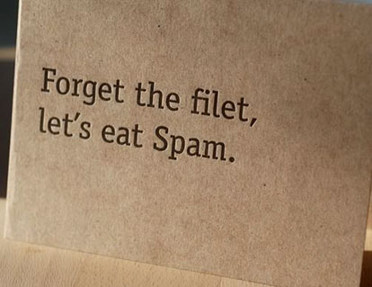
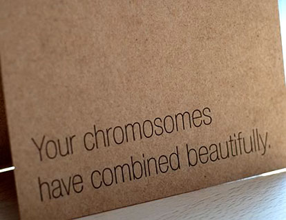
The Recession line (made to spark a smile in tough times). Who’s the creative wiz with the great sense of humor behind those? You must have had so much fun making them.
ROFL, the line is definitely in the voice of me and Tiff. Those lines are basically how we speak to each other. Tiff’s favorite would have to be “Since you’re oldest, can you pay?”.
When we were concepting the line, we came up with ideas separately. Then we came together with lists, picked the ones we both laughed to on first read and then threw them into their existing categories. We both do not have copy writing backgrounds so we were kinda nervous that these were lines we laughed to, but wouldn’t be funny to people or they wouldn’t get our weird sense of humor. But when we launched the cards at the New York International Gift Fair this past January, they were a hit. Buyers were standing at the “recession” wall and laughing. We knew then we had something. The line has become pretty popular so we’ve launched a Recession Holiday line at the recent NYIGF last month.
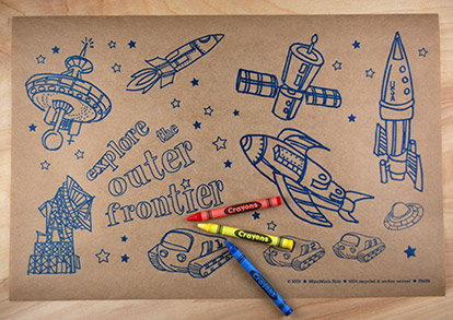
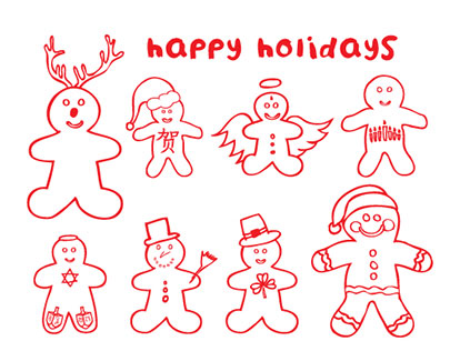
You make a line of color-in cards and placemats for kids—crayons included. How did those come about?
Every product line from 9SpotMonk is inspired by something personal. The colour in cards were inspired by my daughter, who will turn 5 this fall. She loves to colour and having a mother who has endless off cuts to recycle, would colour in the cards and give them to our family and friends.
Tiff and I then thought it would be nice to do a small line of just that—colour in cards with crayons for kids to colour in and send to family and friends. We printed on 100% recycled stock in our signature orange and paired them with matching envelopes. The initial launch was 14 designs and has become so popular, we added 8 more and Christmas and Chanukah cards as well.
For place mats, I realized that the kids stay in their seats and relatively more quiet in restaurants where they had something to occupy their time before the food came. So I applied the colour in cards idea to place mats. Our biggest compliment was getting the Space Exploration place mats into the National Archives in DC. They were having a space themed exhibit and our place mats tied in nicely.
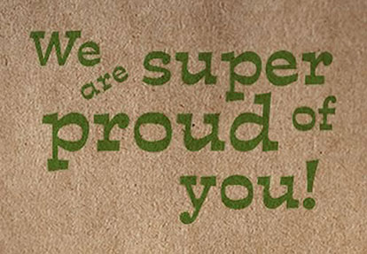
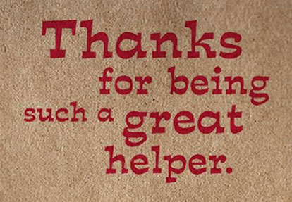
9SpotMonk does more than stationary and greeting cards for all occasions. You make notebooks, coasters, onesies and more. What’s the next mountain for you to conquer?
We just launched a line of kids encouragement cards. They’re for school aged kids, a note here and there—in the school bag, the lunch box, a note when they come home from school.
Okay, last thing. Where does the name 9SpotMonk come from?
Our company name came from my love of monks as a child. I spent my summers in Hong Kong since I was 2 years old and was exposed to a lot of kung fu movies. The cool togas, all that kung fu fighting, I wanted to be a monk! When I was thinking of ideas for the company name, all that good stuff came back to me.
There was one monastery of monks in China who, using incense, burned 9 dots, 3×3, on their foreheads to signify devotion, sacrifice, etc. So the 9Spot part of the name signifies to me my devotion to the company and the craft of design and letterpress.
I was a little nervous that the name was too abstract or weird. But it’s weird in the way where people remember. They may not remember the whole thing, but they remember.
Comments are closed.