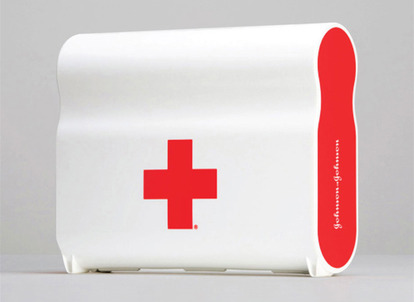
Johnson & Johnson’s new First Aid Kit
We’re the first to admit that when an object’s form has been highly prioritized in its design we’re quick to give it some attention, at least long enough to see if it deserves even more. (What can we say? We like pretty.)
So when Harry Allen‘s redesign of Johnson and Johnson’s First Aid Kit kept buzzing our radar recently, we couldn’t help but stop and stare. It’s quite the specimen.
The interest comes on the heels of the kit being named Best of Category for Packaging in this year’s I.D Magazine Annual Design Review. As does happen, an award tends to make a person stop and wonder what makes the winner so special. So we did, and here’s what we think.
Drop dead gorgeous
Yes it’s beautiful, but isn’t that really how it should be? Shouldn’t everything we surround ourselves with have the potential to delight us in as many ways as possible—one of those being how it looks?
It’s unfortunate that it ever was acceptable for ordinary things to be made to look ordinary, or even worse, ugly.
So as for the beautification of this first aid kit, we say well done.
Recognize
But. What if we then said the qualities that make this object pleasing also make it highly functional, then wouldn’t the way it looks also serve a second and possibly greater purpose?
There’s no doubt the shape, color, contrast, logos—everything that catches your eye when you look at the First Aid Kit—are undeniably simple. The simplicity makes it attractive, and also makes it instantly recognizable.
When the moment strikes and you need a First Aid Kit, that’s precisely what should happen. At first glance, whether you’ve ever seen it before or not, you know what it is.
Form is function.
This idea can be taken one step further as the designer mentions in a recent New York Times article, “When something’s more beautiful, maybe you’ll leave it out rather than trying to hide it under the counter, which is a good thing.” Making it accessible when it needs to be.
Aesthetic utility
Good riddance to the hinged cheapy handle. The case simply curves to fit the grab of your hand.
It stands on end, making it easy to store. The bright red ends face you, making it easy to see.
A case for visible space
One more word in favor of the beauty of this thing. When you live in an open studio as we do (small spaces and dorm rooms also apply), storage space is limited and most of what you have is entirely visible. So when something looks good enough to sit atop a cabinet instead of inside it, on the counter instead of underneath it, that’s a win.
A tip when shopping for this: on the shelf and online you’ll see the kit pictured with a label attached (aptly titled in the packaging world: a belly belt). This label won no awards. Its kinda uggo. Simply throw it away once you’ve read about the 200 items inside your case.
In the car, in the kitchen, at the office—you decide. Johnson & Johnson’s new First Aid Kit is available at Target for $18.
Also for sale at:

Comments are closed.